The Evolution of User Interfaces in Operating Systems
2 August 2026
The way we interact with computers has changed more dramatically than the hardware inside them. In the span of a few decades, we moved from punch cards to voice assistants, from blinking cursors to touchscreens, from memorizing commands to pointing at icons. The user interface is not just a layer on top of the operating system; it is the operating system from the user's perspective. Everything else, the kernel, the drivers, the file system, is invisible. What users see and touch is the interface. Understanding how these interfaces evolved is not just a history lesson. It explains why certain design patterns persist, why others failed, and where the industry is heading.
The Era of Command Lines: Power Through Abstraction
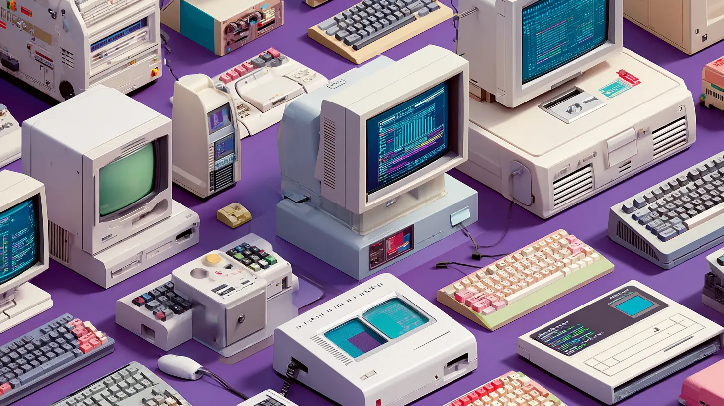
Before graphical displays became affordable, the interface was the terminal. The command line interface (CLI) was not a design choice as much as a technical necessity. Early mainframes and minicomputers used teleprinters and later cathode ray tube terminals that could only display monospaced text. The user typed a command, pressed Enter, and waited for the system to respond. There was no mouse, no windows, no color, no graphics.The command line was unforgiving but incredibly powerful. Users had to know exact syntax, flag combinations, and file paths. Mistakes were punished with terse error messages. This created a high barrier to entry, but it also enabled a level of control that modern graphical interfaces still struggle to replicate. A skilled Unix user can chain commands with pipes, redirect output, and write shell scripts that automate complex tasks in seconds. The CLI remains alive today precisely because it is scriptable and composable. Every modern operating system, including macOS, Windows, and Linux, still ships with a terminal emulator.
The key lesson from the CLI era is that efficiency and learnability are often in direct opposition. The CLI is efficient for experts but nearly impossible for novices. The graphical user interface (GUI) flipped that equation. It prioritized learnability over raw speed, at least initially. The trade-off was not a mistake; it was a necessary step for the market to expand beyond engineers and researchers.
The Graphical User Interface: Xerox PARC and the Metaphor That Won
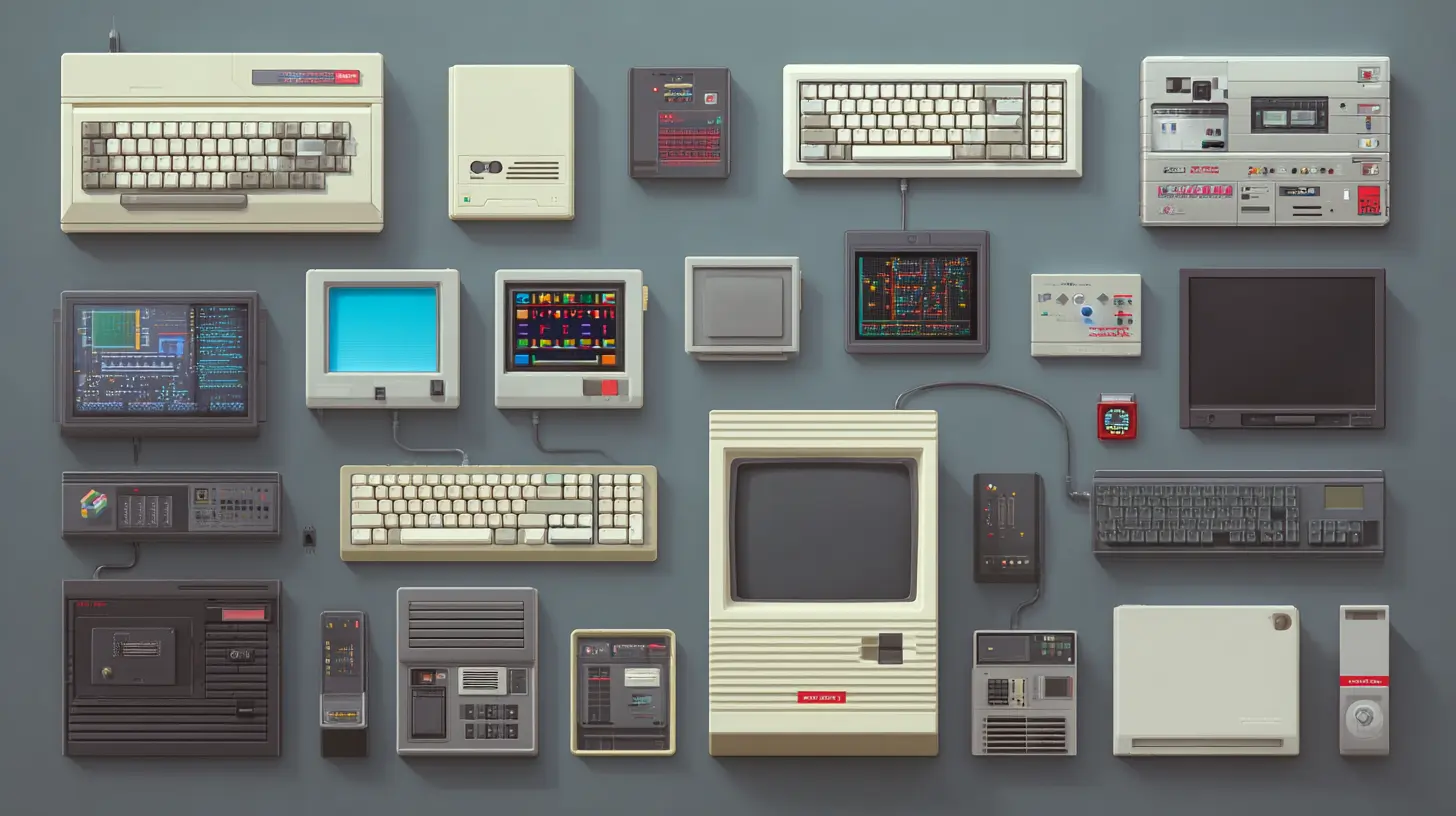
The story of the GUI is well known, but the implications are often understated. Xerox PARC developed the Alto in the 1970s, which introduced the desktop metaphor, windows, icons, menus, and a pointing device. Apple and Microsoft later commercialized these ideas. The critical innovation was not the graphics themselves but the use of metaphor. Files became documents. Directories became folders. Deleting became throwing something in the trash. The computer no longer required the user to think in abstract terms like inode numbers or block addresses. The user could think in terms of an office desk.This metaphor was brilliant because it lowered cognitive load. A novice could guess that dragging a file icon into a folder icon would move the file. No manual required. But the metaphor also introduced limitations that persist today. The desktop metaphor is a lie. There is no actual desk inside the computer. The folder is not a physical container. When you copy a file, you are not duplicating a piece of paper. The metaphor works for simple tasks but breaks down when users need to understand paths, permissions, or symbolic links.
The first GUIs were also painfully slow compared to the CLI. Early Macintosh and Windows systems had to redraw entire windows when they were moved. The hardware was just not fast enough for smooth interaction. Yet the usability gains were so significant that users accepted the sluggishness. This is a recurring pattern in UI evolution: usability improvements often come at the cost of raw performance, and the market usually chooses usability.
The Rise of WIMP: Windows, Icons, Menus, and Pointers
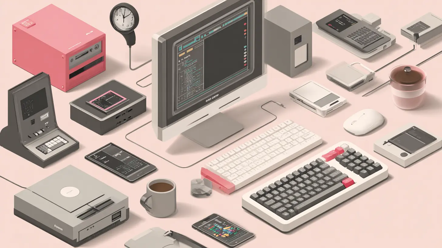
By the late 1980s and early 1990s, the WIMP paradigm became the standard. Windows, icons, menus, and pointers were codified into the design of Windows 3.x, Mac OS System 7, and eventually Linux desktop environments like GNOME and KDE. This paradigm had several unspoken rules. Applications ran inside rectangular windows. Each window had a title bar, close button, and resize handles. Menus were hidden in a bar at the top of the screen or the window. The mouse was the primary input device, with a right-click reserved for context menus.The WIMP model was a massive improvement over the command line, but it introduced new problems. Window management became a chore. Users spent time arranging, resizing, and switching between windows instead of doing actual work. The taskbar and the dock were attempts to solve this, but they only shifted the problem. The sheer number of open windows on a busy desktop led to what researchers call "window thrashing," where users spend more time managing windows than using the content inside them.
Another issue was discoverability. Icons were not always self-explanatory. A floppy disk icon for "Save" made sense in 1990 but is meaningless to a user born after 2000. Toolbar icons with vague symbols required tooltips to explain. The WIMP paradigm assumed that users would learn the interface through trial and error, but trial and error is frustrating when the error means losing work or deleting a file.
Despite these flaws, WIMP dominated for two decades because it was the only viable option for general-purpose computing. It was good enough. The real breakthrough came when the hardware constraints changed, allowing for entirely new interaction models.
The Web as an Interface: The Browser That Ate the Desktop
The mid-1990s saw the rise of the web browser, which initially was just another application inside the WIMP desktop. But the web introduced a different interaction model. Hyperlinks replaced menus. The back button replaced the undo command. Pages were documents, not applications. The browser was a window into a global network, and the interface was the page itself, not the browser chrome.This shift had profound implications for operating systems. The web browser began to subsume local applications. Email moved from desktop clients like Eudora to webmail like Hotmail. Word processing moved from Microsoft Word to Google Docs. The operating system became less relevant to the user experience because the user spent most of their time inside the browser. The OS was reduced to a boot loader for the browser.
This created a crisis for OS vendors. Microsoft fought back with Internet Explorer integration into Windows, which led to antitrust lawsuits. Apple doubled down on native applications. But the trend was unstoppable. The web interface was cross-platform, always up to date, and did not require installation. The cost was performance and offline access, but for many users, the convenience outweighed the drawbacks.
The lesson here is that the interface layer can migrate away from the operating system. The OS is no longer the sole arbiter of user experience. The web has its own interface paradigms, its own navigation patterns, and its own design language. Modern operating systems have had to adapt by integrating web technologies into native apps, as seen with Electron and Progressive Web Apps.
Touch and Mobile: The End of the Mouse
The iPhone in 2007 did not just change the phone market; it changed the entire trajectory of user interfaces. Touch input eliminated the mouse and the keyboard as primary input devices. The interface became direct manipulation. You did not click a button; you tapped it with your finger. You did not drag a scrollbar; you swiped the content itself. This was a fundamental departure from WIMP.Touch interfaces required bigger targets. A mouse pointer has sub-pixel accuracy; a finger has a contact area of about 8 to 10 millimeters. This forced designers to rethink layout. Menus that required hover states were useless. Right-click context menus were gone. The solution was a new set of metaphors: swipe to delete, pull to refresh, pinch to zoom, and long press for contextual actions. These gestures were not documented in any manual. Users learned them through trial, error, and social sharing.
Mobile operating systems, specifically iOS and Android, also introduced the app-centric model. Instead of windows, there were full-screen apps. Instead of a desktop, there was a home screen with icons. The app store became the distribution mechanism, and the OS became a sandbox manager. This model was simpler for users because there was no file system to navigate in the traditional sense. On iOS, users rarely see the file system. They see a list of photos or a list of documents inside an app.
The trade-off was loss of control. Power users on desktop could manipulate files, automate tasks, and customize the environment. Mobile users were restricted to what the apps allowed. This led to a backlash and the rise of "pro" mobile devices like the iPad Pro, which tried to bring back multitasking and file management. But the fundamental interaction model remains touch-first, and desktop interfaces have been forced to borrow mobile patterns, such as hamburger menus and swipe gestures, often with mixed results.
The Modern Hybrid: Gestures, Voice, and Adaptive Design
Today, operating systems are no longer purely mouse-driven or touch-driven. They are hybrid. Windows 11, macOS, and the major Linux desktops all support touchscreens to some degree, but they are still optimized for the mouse and keyboard. iOS and iPadOS have added trackpad and mouse support. The lines have blurred.The most significant recent evolution is the integration of gestures. On macOS, swiping with three fingers switches between desktops. On Windows 11, swiping from the edge opens widgets or the notification center. On mobile, gesture navigation replaced the home button. These gestures are efficient because they do not require moving the cursor to a specific target. They are spatial and directional. But they are also invisible. There is no visual affordance for a swipe. Users must discover them through experimentation or online tutorials. This is a known usability problem.
Voice interfaces have also entered the mainstream. Siri, Cortana, Google Assistant, and Alexa are not just apps; they are alternative interfaces to the operating system. You can ask the system to open apps, set timers, send messages, or search the web. Voice is excellent for hands-free tasks and for users with motor impairments. It is terrible for precise tasks like editing a spreadsheet or adjusting a photo. The challenge is that voice interfaces require a different kind of feedback. There is no visual confirmation, and errors are more jarring.
Adaptive design is another emerging trend. Modern operating systems can change their interface based on the form factor, the user's posture, or the available hardware. For example, Windows 11 has different layouts for touch mode and desktop mode. Android has a "foldable" mode that changes the interface when the device is unfolded. This adaptability is necessary because the same operating system now runs on devices ranging from smartwatches to large-screen desktops. The interface must scale, not just in size but in interaction model.
The Role of Accessibility in Shaping Interfaces
Accessibility is often treated as an afterthought, but it has actually driven many of the most important interface innovations. The command line was inherently inaccessible to blind users until screen readers were developed. The GUI was a step backward for blind users because it relied on visual metaphors. This forced the development of assistive technologies like VoiceOver on macOS and Narrator on Windows. These tools parse the interface hierarchy and read it aloud, but they only work if the application follows accessibility guidelines.The push for accessibility has led to better interfaces for everyone. Keyboard shortcuts, which were once the domain of power users, are now standard on every OS. High contrast modes help users with low vision but also help users in bright sunlight. Haptic feedback on mobile devices provides confirmation for users who cannot see the screen. The lesson is that designing for the edge cases often improves the experience for the average user.
A common misconception is that accessibility means adding a separate mode. In reality, the best accessibility is invisible. It is baked into the design from the start. For example, ensuring that all UI elements have a defined focus order benefits keyboard users and screen reader users alike. It also helps power users who prefer to navigate without a mouse.
Common Mistakes and Misconceptions in UI Design
One of the biggest mistakes in OS interface design is prioritizing aesthetics over usability. The translucent materials, frosted glass effects, and complex animations in modern OSes look impressive but can slow down the interface and distract the user. A classic example is the Windows Vista Aero interface, which consumed significant GPU resources for visual effects that did not improve task completion times. Apple's macOS has also been criticized for animations that delay the user, such as the genie effect for minimizing windows.Another mistake is over-nesting. A user should be able to reach any common setting within two or three clicks. Many operating systems bury essential controls deep inside system settings. For example, changing the default browser on Windows 11 requires navigating through multiple screens and confirming choices. This is not a technical limitation; it is a deliberate design choice to push users toward Microsoft Edge. But it frustrates users and creates a poor experience.
A common misconception is that more features equal a better interface. The opposite is often true. The command line had a steep learning curve because it had too many commands. The modern GUI can suffer from the same problem when it exposes every possible option in the settings menu. The best interfaces hide complexity until it is needed. This is called progressive disclosure. The Mac menu bar hides advanced options behind the Option key. The iPhone camera app hides manual controls behind a separate mode. These are good examples of progressive disclosure.
Another misconception is that the interface must be identical across all devices. This is called consistency, but it can be harmful. A desktop interface with a mouse and a mobile interface with a touchscreen have fundamentally different input methods. Forcing the same layout on both will result in an interface that is awkward on both. The correct approach is consistency of concepts, not consistency of pixels. The concept of "copy" and "paste" should exist everywhere, but the physical gesture can be different.
The Future: AI-Driven and Context-Aware Interfaces
The next major evolution is likely to be driven by artificial intelligence. We are already seeing the beginning of this. Windows Copilot and macOS Siri are attempts to create an assistant that understands context. Instead of the user navigating through menus, the user can ask the system to perform a task. But current assistants are still limited. They can open apps and set reminders, but they cannot reason about the user's intent with deep understanding.A more advanced AI interface would be proactive. It would notice that the user is working on a document and automatically suggest relevant files. It would notice that the user is about to send an email and flag a missing attachment. This is a shift from a command-based interface to an intent-based interface. The user does not need to know how to express the task in the system's language; the system infers the task from the context.
This raises significant design questions. How does the user maintain control? How does the system communicate its reasoning? If the AI makes a mistake, how does the user correct it? These are not trivial problems. The current approach, which is to display a chat window, is likely a transitional phase. A more natural interface might be a combination of voice, gesture, and contextual UI elements that appear only when needed.
Another possibility is the end of the screen as the primary interface. Augmented reality headsets, like Apple Vision Pro and Meta Quest, are attempting to bring the interface into the physical world. Instead of a window on a monitor, you have virtual windows floating in your living room. Instead of a mouse, you use your eyes and hands. This is an enormous shift, and it is unclear if it will succeed. The hardware is still bulky and expensive, and the interaction models are not yet polished. But the direction is clear: the interface is moving from the screen to the environment.
Practical Advice for Users and Developers
For users, the most important skill is learning the keyboard shortcuts of your operating system. Even on modern touch-centric systems, keyboard shortcuts are faster than reaching for the mouse. On Windows, learn Win + D to show the desktop, Win + E to open File Explorer, and Alt + Tab to switch windows. On macOS, learn Command + Space for Spotlight, Command + Tab for app switching, and Command + W to close windows. These small investments pay off daily.For developers, the most important principle is to respect the platform's conventions. Users have learned certain behaviors from the OS, and breaking those conventions confuses them. For example, on macOS, the menu bar is at the top of the screen, and the close button is on the left. If your app puts the menu elsewhere, users will struggle. On Windows, the close button is on the right, and the menu is usually in the title bar. Do not reinvent the wheel.
Another practical recommendation is to test your interface with real users who are not tech-savvy. Developers are the worst testers of their own interfaces because they know how everything works. A novice user will reveal assumptions you did not know you made. This is especially important for operating system interfaces, where errors are costly and users cannot easily switch to a different OS.
Finally, do not ignore the command line. Even in a world of graphical interfaces, the terminal remains a powerful tool for troubleshooting, automation, and advanced control. Learning basic command line skills, such as navigating directories, copying files, and viewing processes, will make you a more effective user of any operating system. The CLI is not a relic; it is a complementary interface that excels where the GUI is weak.
Conclusion
The evolution of user interfaces in operating systems is a story of trade-offs. The command line traded learnability for power. The GUI traded power for accessibility. The web traded installation for reach. Touch traded precision for directness. Voice traded control for convenience. Each shift solved a problem but created new ones. The current state of operating systems is a layered collection of all these paradigms. We have a desktop with icons, a terminal with commands, a browser with tabs, and a voice assistant with a microphone. The challenge for the next generation of OS designers is not to pick one paradigm but to integrate them seamlessly, so the user can switch from a mouse to a touchscreen to a voice command without thinking about it. The interface should disappear. The user should only see their work. That is the ultimate goal, and we are not there yet.
all images in this post were generated using AI tools
Category:
Operating SystemsAuthor:

Ugo Coleman
Discussion
rate this article
1 comments
Bridget Perry
It's fascinating to see how user interfaces have transformed over the years. Each new design reflects not just technology, but also our changing expectations and interactions with computers.
August 2, 2026 at 4:07 AM